Introduction
Telling the life story of binary stars is difficult and computationally expensive given the complexity of their evolution and the many permutations of possible stellar outcomes. In order to gain deeper insight into pathways of stellar evolution, we use the Binary Population Synthesis (BPS) code, POSYDON, to accurately simulate large populations of binary interactions and yield statistical properties without such a computationally expensive budget. The inner structure of this code is an intermingled network of simulations such as the Modules for Experiments in Stellar Astrophysics (MESA) and algorithmic analysis of stellar evolution data (Fragos et al. 2023). This data can help many scientists understand how binary stars evolve. Furthermore, we begin to develop a story that describes how these binaries become compact objects (CC) and other extreme stellar objects; the progenitors of gravitational wave sources.
Despite having such a tool, fully grasping the binary stellar evolution story relies on interpreting data presentation. Hence, we employ visualization and illustrative methods to enhance data comprehension and convey the stellar narrative immediately upon data output. To aid in the analysis of data and relay the evolutionary narrative to the public, a visualization component must be developed in the POSYDON code.
Methods
The development of our visualization tool involved a comprehensive approach, integrating both physical and computational materials. An essential goal was to create visualizations that not only facilitate scientific research for experts but also effectively communicate scientific concepts to the broader public. To achieve both of these objectives, the methods employed can be categorized into two main approaches: illustrative and computational. By combining the strengths of both approaches, we successfully established an intuitive and coherent visual framework that effectively merges the power of illustrative representations with the precision of computational visualization.
Illustrative Methods
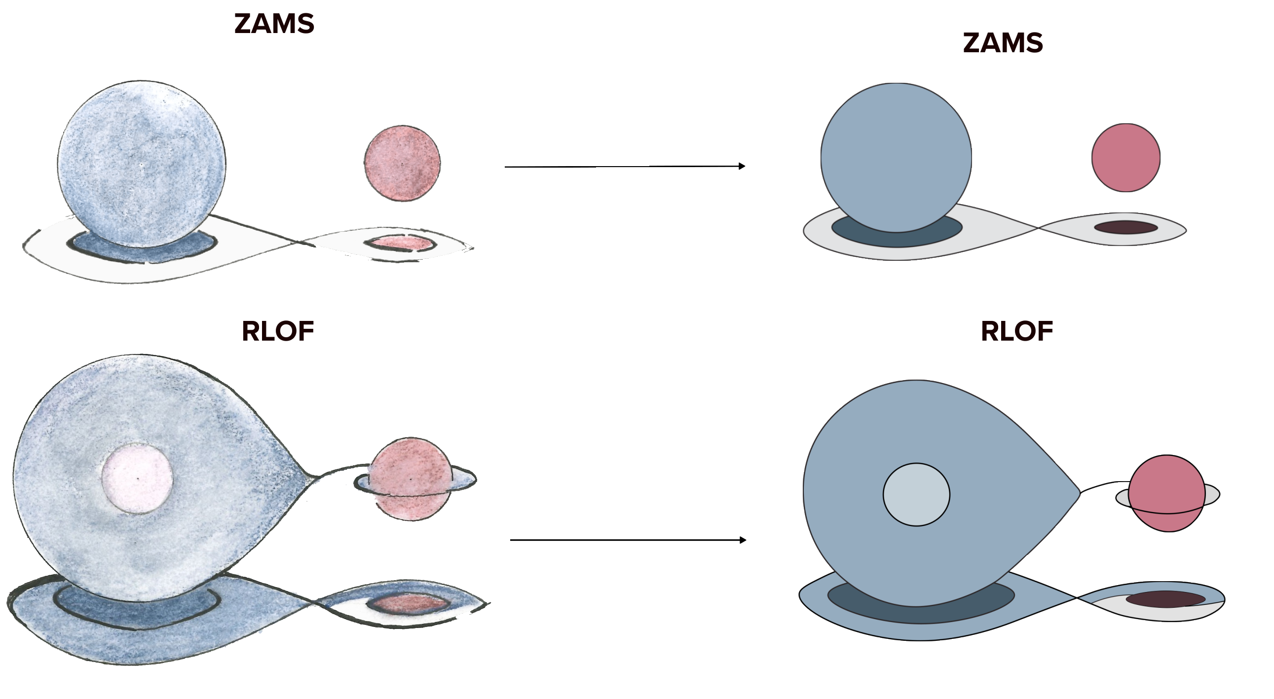
Prior to computational work, initial illustrations were pivotal in creating the stellar evolution visualization tool. They depicted evolution stages and events while offering a flexible foundation for updates.
Crafted with varying pencil hardness, archival ink pens, and color pencils in a muted palette, each detail was meticulously attended to. Spheres used compasses, and curves employed a flexible curve ruler.
High-quality scans used 250 GSM white Stonehenge paper.
Computational Methods
After creating the visualizations, the next step was developing an interactive version using the POSYDON code.
Leveraging Python packages such as Matplotlib, PIL, Cv2, we created an integrated Van Den Heuvel diagram gen-
erator. First, a BPS model run, with specific keyword arguments, and a large population yielded a large Pandas
DataFrame (DF). The function getstar returns one star from the population and displays its important information,
such as state and event names, step names, mass, state, separation, etc., for the following visualization functions.
Having established a DF, MiniVizView, with relevant stellar evolution information, we assign a function named
getimage which receives the DF and extracts pertinent information for constructing a Van Den Heuvel diagram. Each
chartobject acts as an image in the visualization and requires an axis and an image as input.

The function vdh is
the integral function that created the Van Den Heuvel Diagrams. It iterates over columns, searches for corresponding
visualizations in a database based on a specific file path that is stitched together by the output of the getimage
function, and places connected chart objects in chronological order. During this process, it uses PIL to turn the image
into a numpy array of pixels with RGB values.
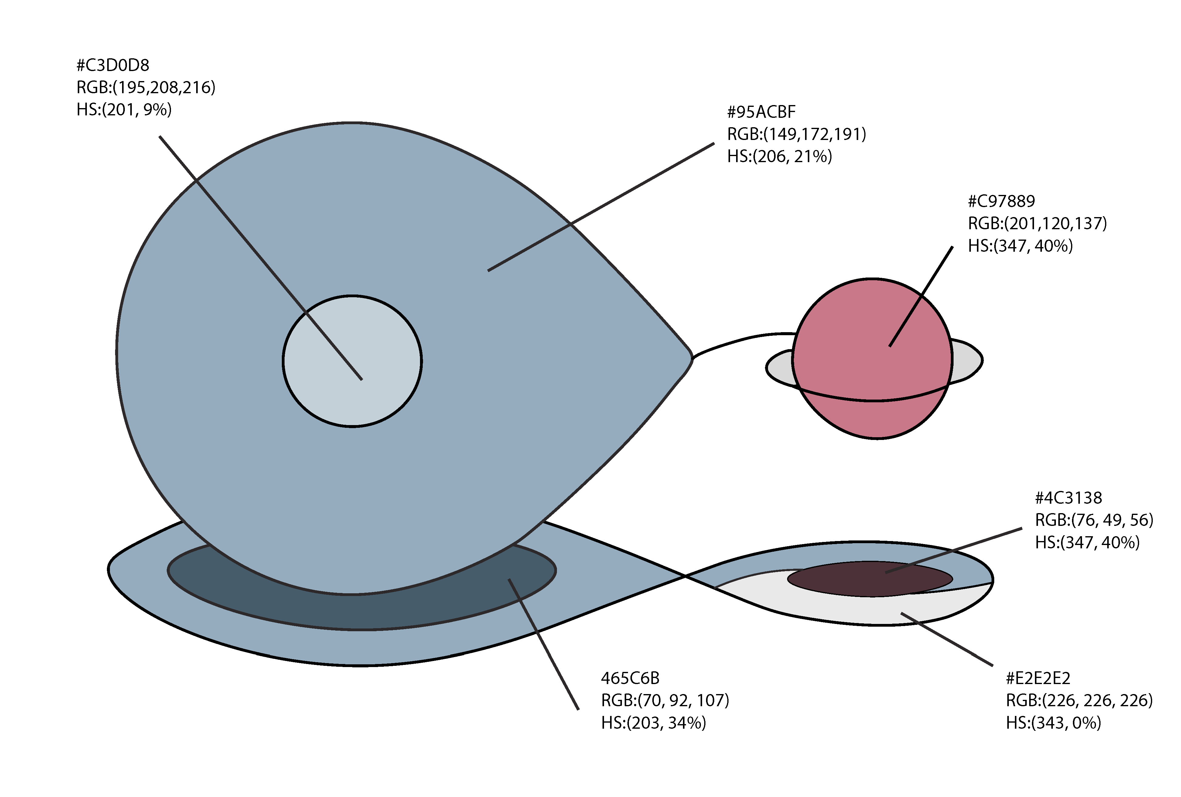
A list of effective temperatures of the stars at each stage is passed
to a function that uses a database of corresponding Hexadecimal (hex) and RGB codes based on spectral type and
temperature (Harre & Heller 2021). This is then used to color each star in the diagram. The visualizations, thus, hold
the temperature and color information of the stars in the binary system. The function utilizes connectionpatches as the
connecting pathways between each stage/event. The function accounts for null results and provides researchers with
appropriate messages to notify if a visualization doesn’t exist or isn’t found. At each time step, points are plotted on a
vertical line adjacent to the chart, introducing a temporal dimension to the visualization. The vdh function facilitates
the creation of a well-organized timeline, documenting the stellar evolution of each binary system based solely on the
output data from POSYDON.
Scientific Communication
BinaryStory plays a pivotal role in advancing scientific communication regarding the complex processes of stellar evolution. Through its visual representations, it effectively conveys information as an informative graphic, distinct from editorial illustration (Christiansen 2021). Striking a balance between raw data display and illustrative elements, BinaryStory deliberately adopts an illustrative approach to engage viewers with the data content. The visual appeal of BinaryStory lies in its simplicity, adhering to Tufte's design principles, such as data-to-ink ratio (Tufte 2016). Thoughtfully curated color aesthetics avoid high-contrast hues and discordant palettes, ensuring a coherent and visually captivating presentation. BinaryStory directly integrates with data, departing from conventional post-processing methods for graphics. It swiftly saves visuals in formats like png, jpg, or pdf, perfect for posters, articles, and presentations, enhancing the binary stellar evolution narrative. The resolution quality of the visualization enables easy import to graphics editors like Adobe Illustrator, allowing customization for scientific communication. As a valuable tool, BinaryStory facilitates clear and captivating depiction of binary star evolution across diverse formats, providing astronomers with the means of illustrating the compelling story of binary star systems.
Conclusion and Further Work
BinaryStory is a user-friendly, data integrated, tool that enhances comprehension of binary star systems by bridging complex data and illustrative elements for effective scientific communication. Its versatility and accessibility are valuable for researchers conveying the narrative of binary stellar evolution. Future developments could include interactive 3D visuals to further enhance user experience. Our study focused on one indexed star's evolution, but specialized 2-D Grid plots could elucidate channel contributions and simulation accuracy for the entire population. Beyond visualization, BinaryStory transforms communication by merging data analysis with storytelling to deepen understanding of binary stellar evolution.
References
Christiansen, J. 2021, Visualizing science: Illustration and beyond, , , accessed: 2023-8-9
Fragos, T., Andrews, J. J., Bavera, S. S., et al. 2023, ApJS, 264, 45
Harre, J.-V., & Heller, R. 2021, Astron. Nachr.
Tauris, T. M., & van den Heuvel, E. P. J. 2023, Physics of Binary Star Evolution. From Stars to X-ray Binaries and Gravitational Wave Sources, doi:10.48550/arXiv.2305.09388
Tufte, E. 2016, in Diagrammatik-Reader, ed. B. Schneider, C. Ernst, & J. W ̈opking (Berlin, Boston: De Gruyter), 219–230
About Me

My name is Dean kousiounelos and I'm a rising junior at Lake Forest
College double majoring in Physics and Art.
This summer I had the great opportunity to
work with Dr. Seth Gossage and Dr. Vicky Kalogera
on a visualization code for binary population
synthesis data from POSYDON.
I am working in the nexus of art and science, looking to bridge a gap
that has long been defined by both artists and scientists alike through
data visualization and graphic illustration. By creating
visualizations that are integrated with the POSYDON data, a stellar story emerges,
bridging both the quantitative and the qualitative aspects of the evolutionary narrative.
Contact info: kousiounelosdm@lakeforest.edu
Acknowledgements
I want to thank Dr. Seth Gossage and Dr. Vicky Kalogera for their mentorship; the REU leaders, Dr. Aaron Geller and Dr. Emily Leiner, and my cohort for their valuable support. This material is based upon work supported by the National Science Foundation under grant No.AST 2149425, a Research Experience s for Undergraduates (REU) grant awarded to CIERA at Northwestern University. Any opinions, findings, conclusions, or recommendations expressed in this material are those of the author(s) and do not necessarily reflect the views of the National Science Foundation. This research was supported in part through the computational resources and staff contributions provided for the Quest high-performance computing facility at Northwestern University which is jointly supported by the Office of the Provost, the Office for Research, and Northwestern University Information Technology.